Color of
2019
17-3938
TM
2019
PANTONE
the Year
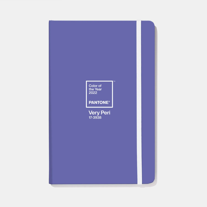
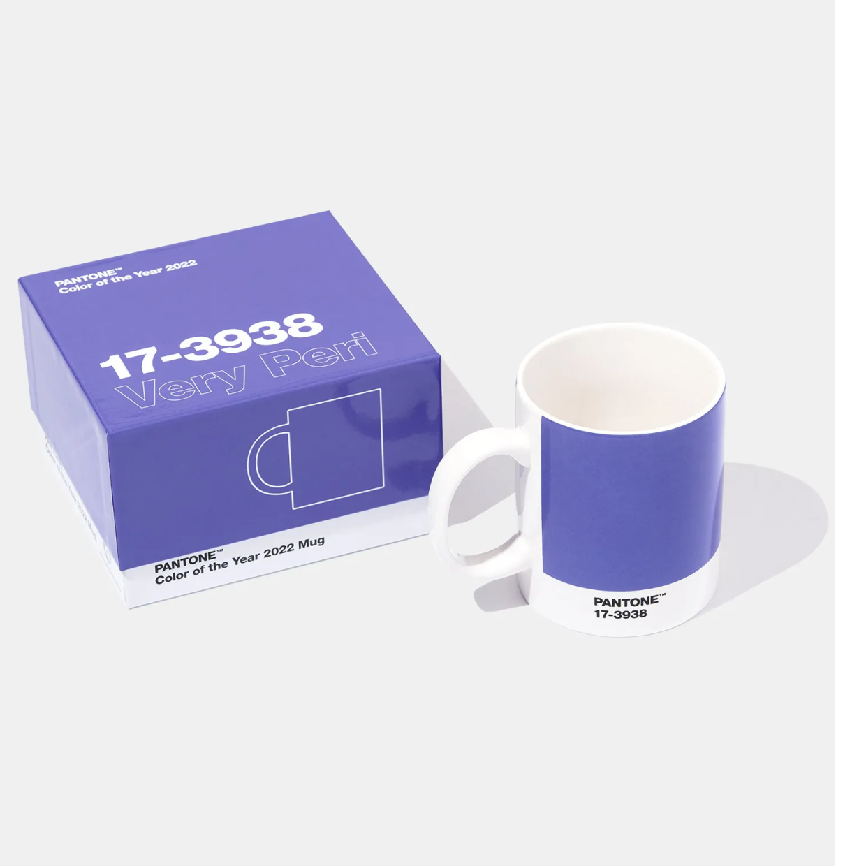
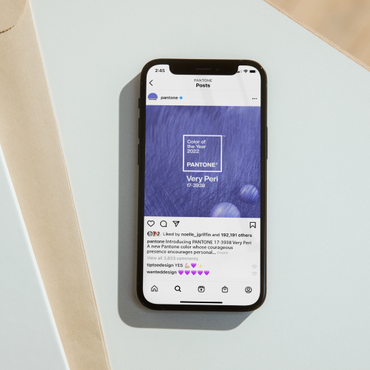
Color of
the Year
2022
the Year
2022
TM
PANTONE

Very Peri
PANTONE 17-3938 Very Peri is a symbol of the global zeitgeist of the moment and the transition we are going through. As we emerge from an intense period of isolation, our notions and standards are changing, and our physical and digital lives have merged in new ways. Digital design helps us to stretch the limits of reality, opening the door to a dynamic virtual world where we can explore and create new color possibilities. With trends in gaming, the expanding popularity of the metaverse and rising artistic community in the digital space PANTONE 17-3938 Very Peri illustrates the fusion of modern life and how color trends in the digital world are being manifested in the physical world and vice versa.
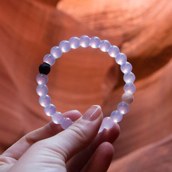
Pantone, разработчик профессиональных цветовых стандартов и цифровых решений для индустрии дизайна, сегодня назвала PANTONE 16-1546 Живой коралл (Living Coral), оживляющий и жизнеутверждающий оттенок оранжевого с золотистыми полутонами, цветом Pantone® 2019 года. Мы получаем энергию от природы. Подобно тому, как коралловый риф являются источником пропитания и убежищем для морской жизни, яркий, но мягкий PANTONE 16-1546 Живой коралл принимает нас в свои теплые и заботливые объятья, дающие комфорт и помогающие держаться на плаву в нашем постоянно меняющемся мире.
Color
values
The Pantone Color of the Year 2022 can be found in the following color systems:
Plus series
Fashion, home + interior
PANTONE 17-3938 Very Peri TCX
CMYK:
sRGB:
HTML:
sRGB:
HTML:
67 60 0 0
102 103 171
6667AB
102 103 171
6667AB
PANTONE 2366 C
Plus series
CMYK:
sRGB:
HTML:
sRGB:
HTML:
64 55 0 0
255 106 109 205
6a6dcd
6a6dcd
PANTONE 2366 C
CMYK:
sRGB:
HTML:
sRGB:
HTML:
64 55 0 0
106 109 205
6a6dcd
106 109 205
6a6dcd
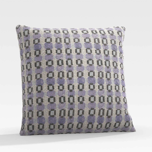
#6667AB
Color
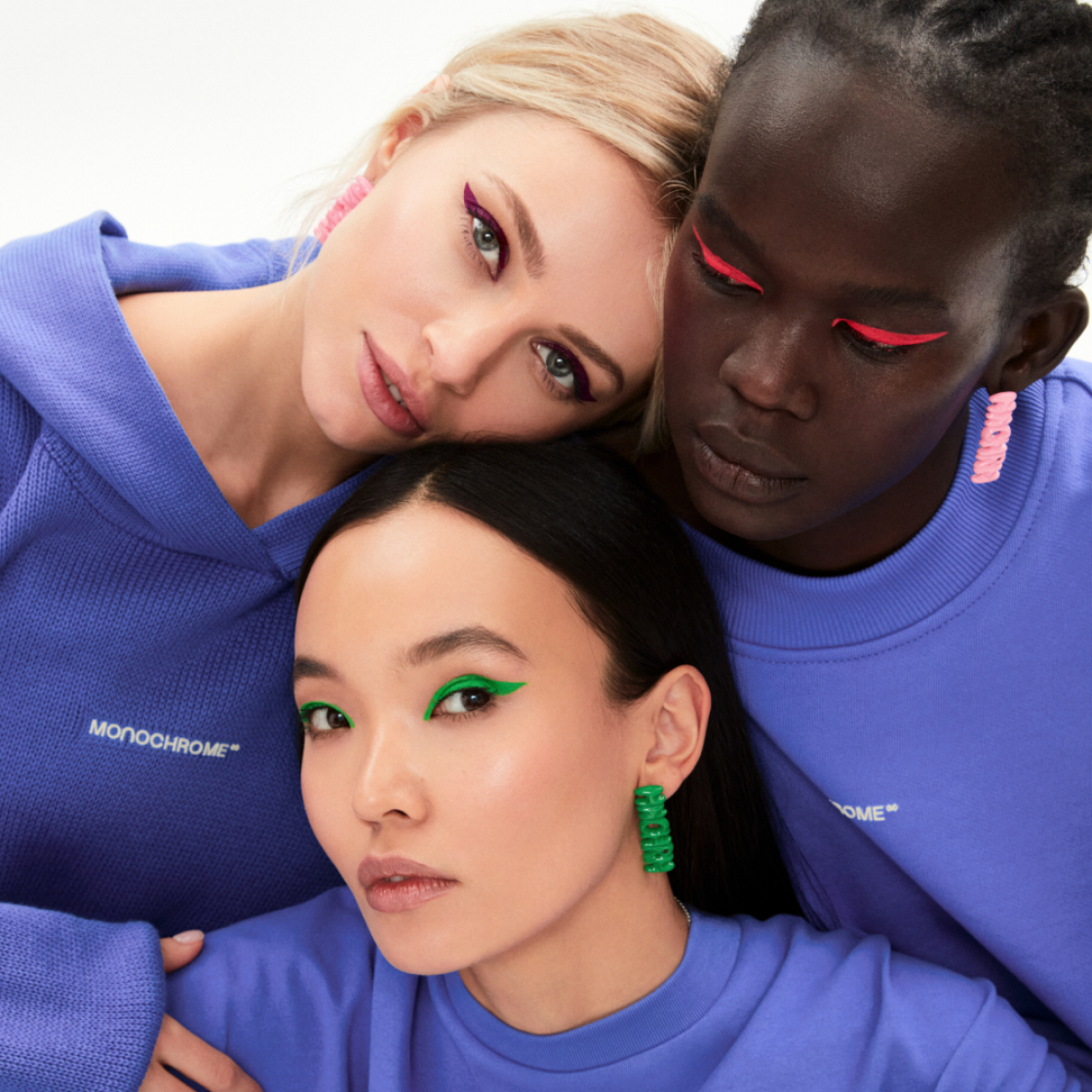
We have created four unique color palettes featuring PANTONE 17-3938 Very Peri to help you bring this year's special shade into your designs. Each palette conveys a different mood, illustrating PANTONE 17-3938 Very Peri's versatility.
pallets
Amusements
17-3938 Very Peri

17-1937 Hot Pink
18-2133 Pink Flambe
15-2718 Fuchsia Pink
16-4411 Tourmaline
13-0932 Cornsilk
17-1755 Paradise Pink
17-1341 Tawny Orange
Social
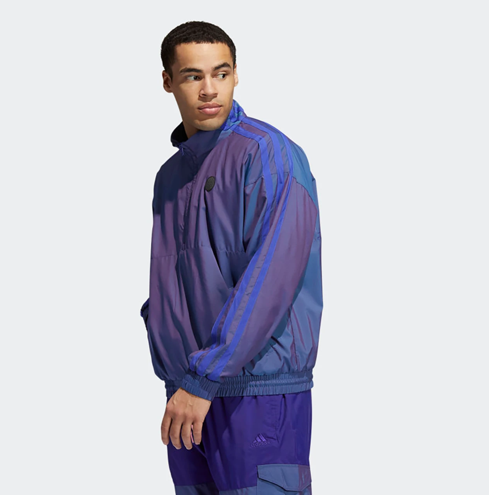
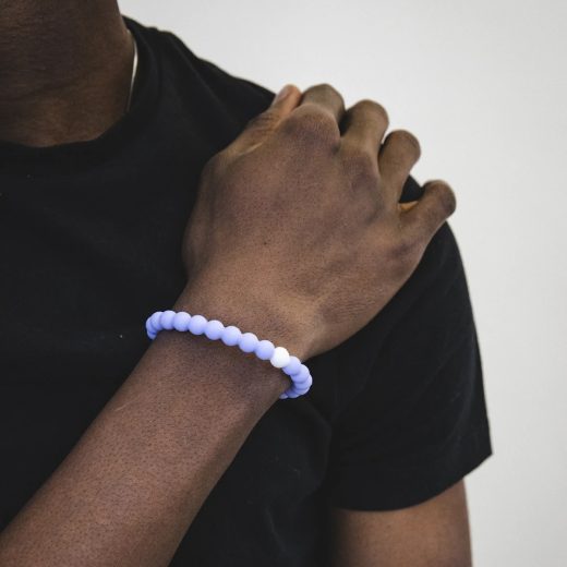
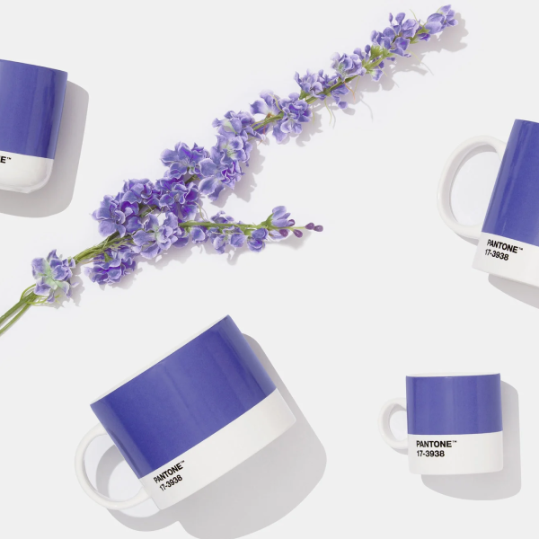
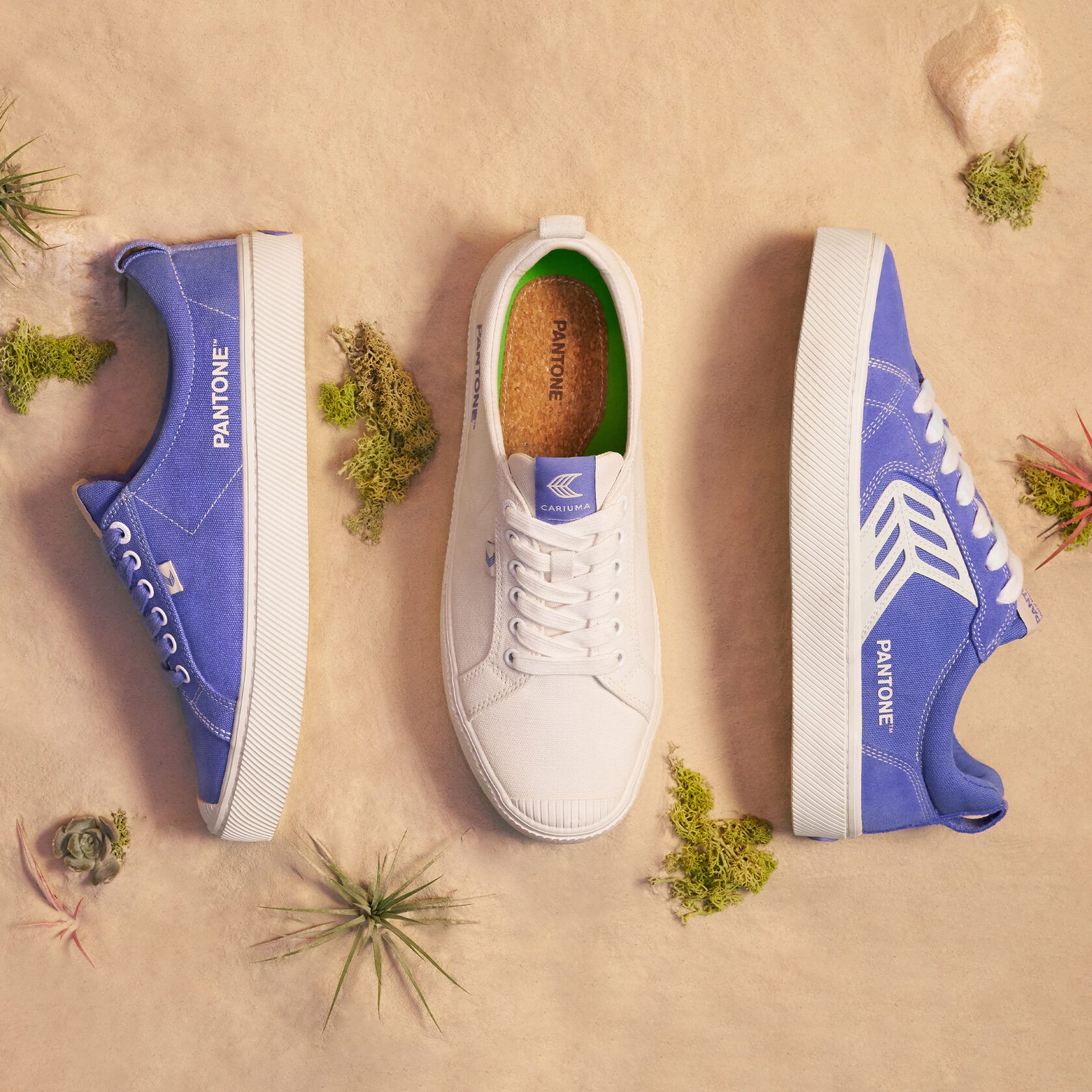
2022 marks the first time a color has been custom created for the Pantone Color of the Year program. PANTONE 17-3938 Very Peri blends the faithfulness and constancy of blue with the energy and excitement of red to introduce an empowering mix of newness to apparel, beauty, home furnishings, product design, and packaging.

media
Fashion &
PANTONE 17-3938 Very Peri, a warm and friendly blue hue with a carefree confidence and joyful attitude, emboldens uninhibited expression and experimentation. This enthusiastic blue hue displays a dynamic presence and a whimsicality that lends itself to unpredictable color harmonies and spontaneous color statements. Futuristic in feeling, PANTONE 17-3938 Very Peri takes on distinct appearances through application to different materials, finishes, and textures, from shimmery metallics, lustrous sheens, and high-tech materials, to hand-crafted looks and natural fibers.
accessories

Microsoft
Highlighting the power of color in digital design, Pantone teamed up with Microsoft to bring the PANTONE Color of the Year 2022 to life in across Microsoft products – including custom Teams backgrounds, Windows wallpapers, a new Edge theme, and a PowerPoint template infused with Very Peri. Microsoft understands the critical role color plays in our digital lives, especially given our increased reliance on digital tools for communication amid a hybrid landscape.
Cosmetics
Suggestive of personal inventiveness and daring imagination, PANTONE 17-3938 Very Peri makes a novel statement for eyes, nails, and especially hair when used in a variety of finishes and applications, from glittery and glam, to dusty matte.
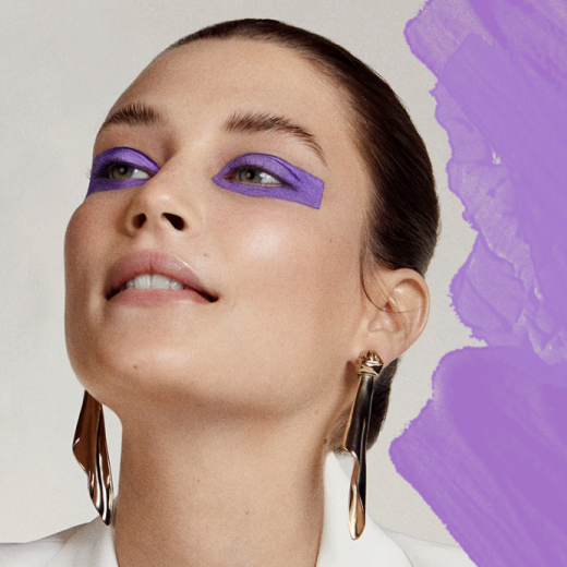

Very Peri Make Up
Product
Fusing together the constancy and continuity of blue with the energy and excitement of red, PANTONE 17-3938 Very Peri conveys a message of credibility as well as creativity. Whether appearing in a fantasy digital realm or in physical materials, PANTONE 17-3938 Very Peri exudes a good-natured warmth that quickly engages the eye, making it an ideal shade for many applications of graphic and multi-media design, as well as packaging.
design
Balancing act
14-0626 Dried Moss
16-1330 Muted Clay
16-5907 Granite Green
15-1905 Burnished Lilac
14-1905 Lotus
18-1718 Hawthorn Rose
17-3938 Very Peri
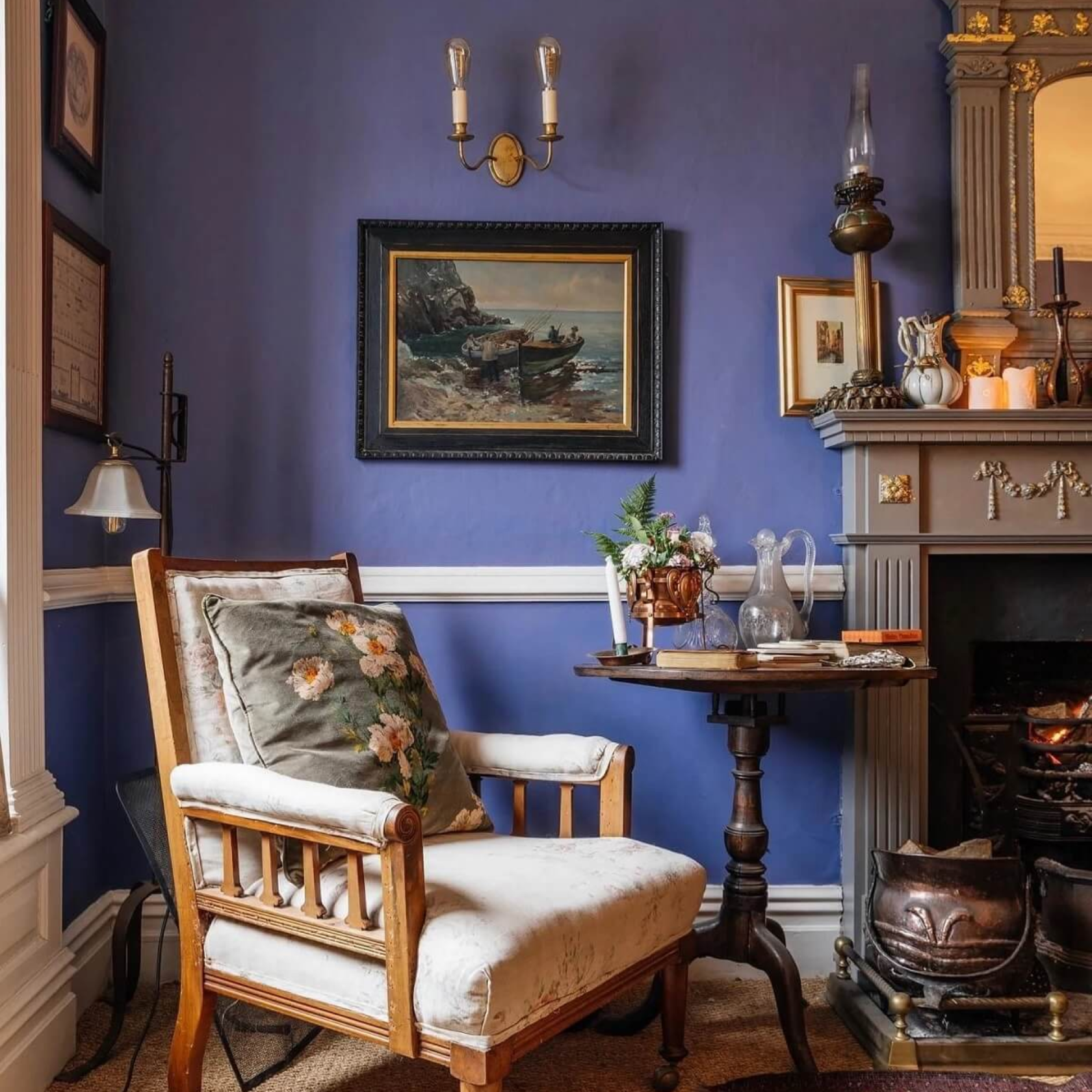
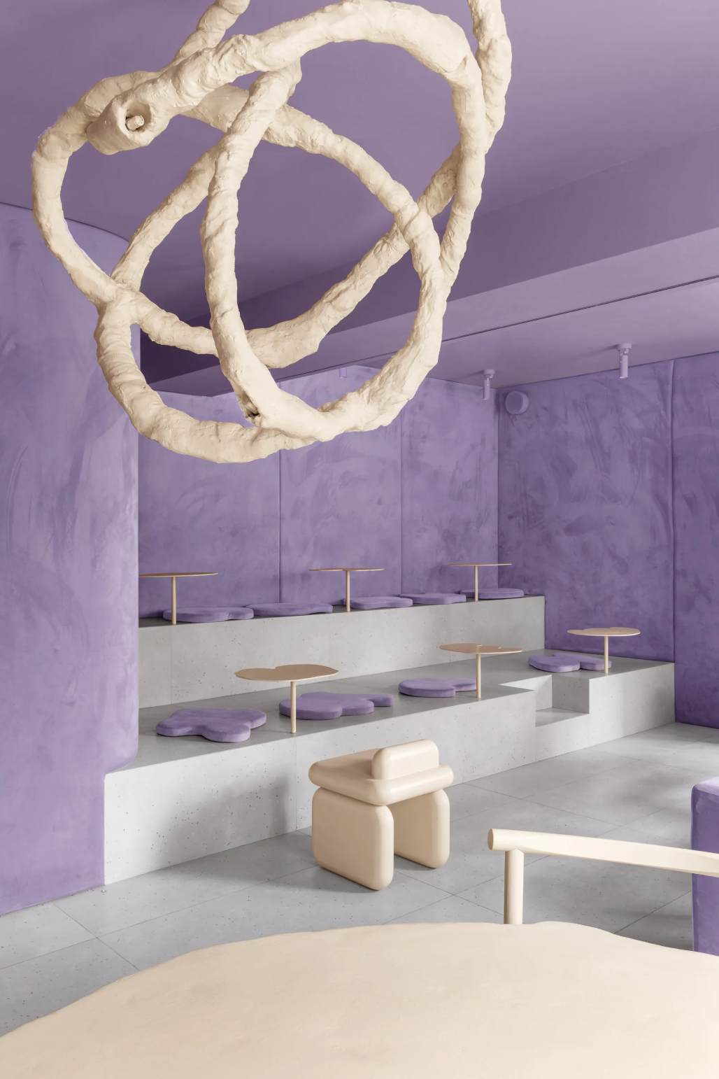
Interior
When used as a bold statement in settings and decor, Living Coral fosters immersive experiences such as pop-up installations and interactive spaces, tied to a playful spirit. As a color linked to tactility and human connection, PANTONE Living Coral in shag rugs, cozy blankets, and lush upholsteries create a warm, comforting, and nurturing feeling in the home. With its ebullient nature, PANTONE Living Coral adds a dramatic pop of color to any room setting whether in decorative accessories, tabletop, or on the wall.